

How do I understand the tool output?
The HHVT is designed to provide the expected increase or decrease from the average number of emergency department visits due to heat-related illness. The tool shows this as the “Departure from Average.” What does this mean, exactly?
Follow this example below for Bladen County:

In this example, the tool tells us that the expected number of emergency department visits on the date highlighted with the red circle is 2.75 times the average number of visits to the emergency department for heat-related illness on that day. For example, if you normally see 3 people in the emergency department for heat illness, on this day, you can expect to see about 8.25 people (3 * 2.75 = 8.25) more than the normal of 3 people or approximately 11 people.
Below this figure, you will find the range. In this case, the “Range of Expected Visits” is 2.59 to 2.92 times the average number. This means that the number of visits could potentially fall anywhere within this range. Continuing with our example, this means that you can expect 7.77-8.76 additional visitors, or 11 to 12 people, to the emergency department for heat related illness on this date.
Using retrospective models to predict emergency department visits in the HHVT
Models were created to predict emergency department (ED) visits for heat-related illness (HRI). These models were based on historical (i.e., retrospective) emergency department visits from 2007 to 2016 and included all visits categorized with the appropriate ICD-9 code for heat-related illness (code: 992.00). This code accounts for any illnesses caused by the effects of high temperatures (i.e., heat stroke, heat syncope, heat exhaustion, etc.).
ED visits were collected within NC DETECT*, a statewide surveillance system that categorizes data from ED visits by the symptoms that each patient presents with at the emergency department. These surveillance systems are important for early detection and monitoring of various health conditions that impact communities.
Each ED visit was linked to the closest weather station to determine the daily maximum heat index observation. Heat Index (or apparent temperature) accounts for the combined effects of air temperature and humidity to provide a more accurate estimate of heat stress on the human body. As an example, if the air temperature is 96°F and the relative humidity is 65%, the heat index is 121°F (NOAA 2016).
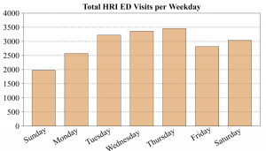 Using statistical models (generalized additive models), the relationships between ED visits and daily maximum heat index were calculated. These models accounted for underlying variations in daily ED visits, such as seasonal variation and variation by day of week, to isolate the effect of heat index on HRI at a county level.
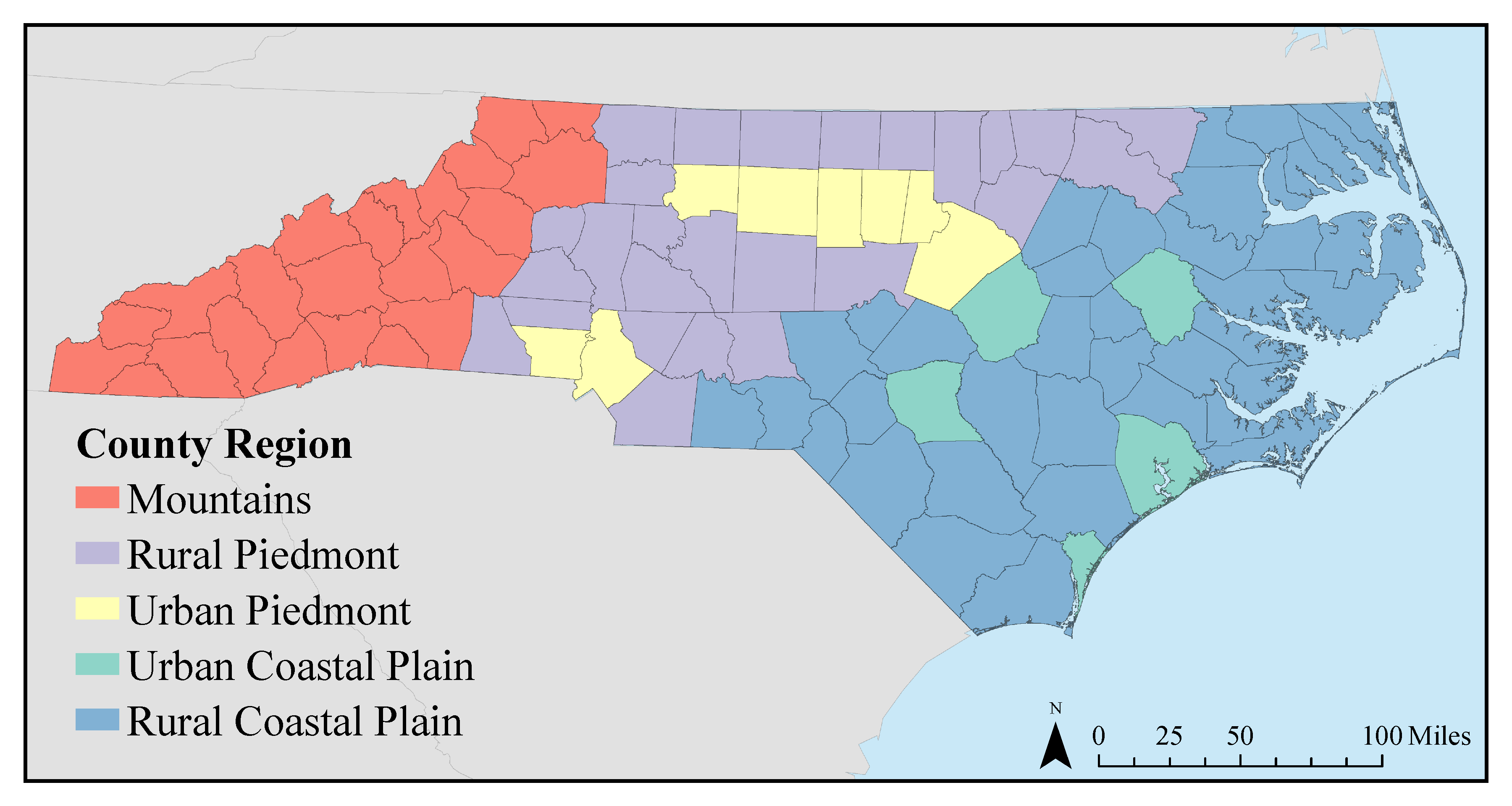
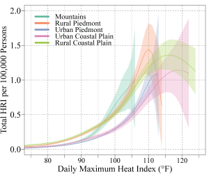
To analyze these relationships and provide the predictions in the HHVT, counties were grouped based on similarities in climate and urban/rural character. Models predicting HRI on a county level were created for rural or urban regions, which is why the HHVT displays urban or rural in the plot title (such as ‘Rural’ Coastal Plain Model in the example graphic above). A map showing the counties within each group can be found below.
*The North Carolina Disease Event Tracking and Epidemiologic Collection Tool (NC DETECT) is an advanced, statewide public health surveillance system. NC DETECT is funded with federal funds by North Carolina Division of Public Health (NC DPH), Public Health Emergency Preparedness Grant (PHEP), and managed through a collaboration between NC DPH and the University of North Carolina at Chapel Hill Department of Emergency Medicine’s Carolina Center for Health Informatics (UNC CCHI). The NC DETECT Data Oversight Committee does not take responsibility for the scientific validity or accuracy of methodology, results, statistical analyses, or conclusions presented.
Maximum Air Temperature vs. Heat Index
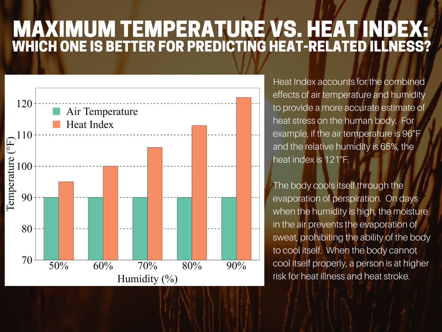
Heat Index accounts for the combined effects of air temperature and humidity to provide a more accurate estimate of heat stress on the human body. For example, if the air temperature is 96°F and the relative humidity is 65%, the heat index is 121°F.
The body cools itself through the evaporation of perspiration. On days when the humidity is high, the moisture in the air prevents the evaporation of sweat, prohibiting the ability of the body to cool itself. When the body cannot cool itself properly, a person is at higher risk for heat illness and heat stroke.
How does the tool use Heat Index?
The HHVT model uses daily forecasts of the maximum heat index to predict the expected number of heat-related emergency department visits up to 5 days into the future. For each day, the forecasted heat index at 1800 UTC (1pm EST, 2pm EDT) for the following 5 days is acquired from the National Digital Forecast Database (NDFD), which is produced by the National Weather Service. For each county in North Carolina, daily heat index forecasts are provided for the location of the nearest automated weather station, which are typically found at airports. These values are used as estimates for the daily maximum heat index across the county and are incorporated into the HHVT model.
 Determining the Threshold for the Warning Levels

This warning system was developed to highlight differences in exposure and vulnerability across the state. Areas with higher rates of heat illness (e.g. rural areas) are warned more frequently and at higher levels (e.g. hotter colors) than areas with lower rates (e.g. urban areas).
This is a “community level” model in that it warns on the basis of the predicted per capita rates of heat illness associated with the nature of the population (e.g. rural) that is present in that community. For example, the rural model for Bladen County predicts a rate of heat illness based on the modeling of heat illness rates for all rural areas across the eastern two-thirds of the state.
Therefore, it is not an “individual level” model, as it does not predict how vulnerable any one person is to the heat. An individual’s vulnerability depends upon their ability to adapt to the heat, their age, weight, health conditions, and other factors. This vulnerability would not vary if they were exposed to the same level of heat in an urban area or a rural area.
The threshold value for each level of warning (e.g. yellow through maroon) was determined from the distribution of per capita rate of emergency room visits for the population of the eastern two-thirds of the state – the coastal Plain and Piedmont.

Interpreting the table
The yellow level is given when any model (e.g. rural, urban, etc.) predicts between 0.10 and 0.21 visits per capita.
The per capita rate of 0.10 corresponds with the 50th percentile. Across the eastern two-thirds of the state, 50% of the days between May 1 and September 30 will show per capita rates of heat illness that exceed 0.10. In the urban and rural models, this corresponds with a daily maximum heat index of 92 and 90°F, respectively. Because the population in urban areas is less exposed to the heat, the 0.10 threshold value is not reached on as many days. Consequently, a higher heat index (92°F) is required for this threshold to be reached relative to the rural area (90°F).
The orange level is given when any model (e.g. rural, urban, etc.) predicts between 0.21 and 0.43 visits per capita.
The per capita rate of 0.21 corresponds with the 25th percentile. Across the eastern two-thirds of the state, 25% of the days between May 1 and September 30 will show per capita rates of heat illness that exceed 0.21. In the urban and rural models, this corresponds with a daily maximum heat index of 100 and 95°F, respectively.
The red level is given when any model (e.g. rural, urban, etc) predicts between 0.43 and 0.60 visits per capita.
The per capita rate of 0.43 corresponds with the 10th percentile. Across the eastern two-thirds of the state, 10% of the days between May 1 and September 30 will show per capita rates of heat illness that exceed 0.43. In the urban and rural models, this corresponds with a daily maximum heat index of 103 and 100°F, respectively.
The purple level is given when any model (e.g. rural, urban, etc.) predicts between 0.60 and 1.10 visits per capita.
The per capita rate of 0.60 corresponds with the 5th percentile. Across the eastern two-thirds of the state, 5% of the days between May 1 and September 30 will show per capita rates of heat illness that exceed 0.60. In the urban and rural models, this corresponds with a daily maximum heat index of 105 and 102°F, respectively.
The maroon level is given when any model (e.g. rural, urban etc) predicts greater than 1.10 visits per capita.
The per capita rate of 1.10 corresponds with the 1/10th percentile. Across the eastern two-thirds of the state, 0.1% of the days between May 1 and September 30 will show per capita rates of heat illness that exceed 1.10. In the urban and rural models, this corresponds with a daily maximum heat index that exceeds 105 and 108°F, respectively.